Mill Architects are a design-led architectural firm based in Dalmeny. They have experience working with both residential clients and commercial clients such as Arnold Clark, Colleti & Co, Creiff Food Company and Howies Restaurants.
Mill Architects approached UNIQ to refresh and update their website to appeal to their target market. Promoting their latest projects and range of services, they wanted a clean, modern website that was easy to navigate.
Some of the key considerations of the Mill Architects website redesign are:
User Experience (UX)
This is the emotive response someone has to your website which can be judged just seconds after first coming into contact with your site. Your homepage design is a critical part of this as well as having engaging and relevant content.
Navigation
One of the most important things to consider when designing a website is navigation, the easier for people to reach the information they need the better. The main feature of creating good website navigation are:
Information hierarchy
The Mill Architects information hierarchy is seen outlined in their menu. It was ordered based on the information priority of their clients. Often websites prioritise their navigation and information based on what they want to tell clients. Understanding the prospective user and their priorities are essential because if the user visits your site and is unable to find what they are looking for, they’re likely to get frustrated and leave.
Google Analytics
This is a platform offered by Google to analyse and help you report on your website, it’s the best way to find out more about what people do when they visit your site. We found through Google analytics that the most popular page was, in fact, the ‘Project’ page. This is helpful as we know that the ‘Project’ page gives creditability to the company with evidence of past work, plenty of photographs and an outline of each. With this information, we know to create more content for this page that will continue to increase the company’s credibility and keep potential clients coming back to the site.

Design
The actual design of the website also plays a significant factor in its success.
Imagery
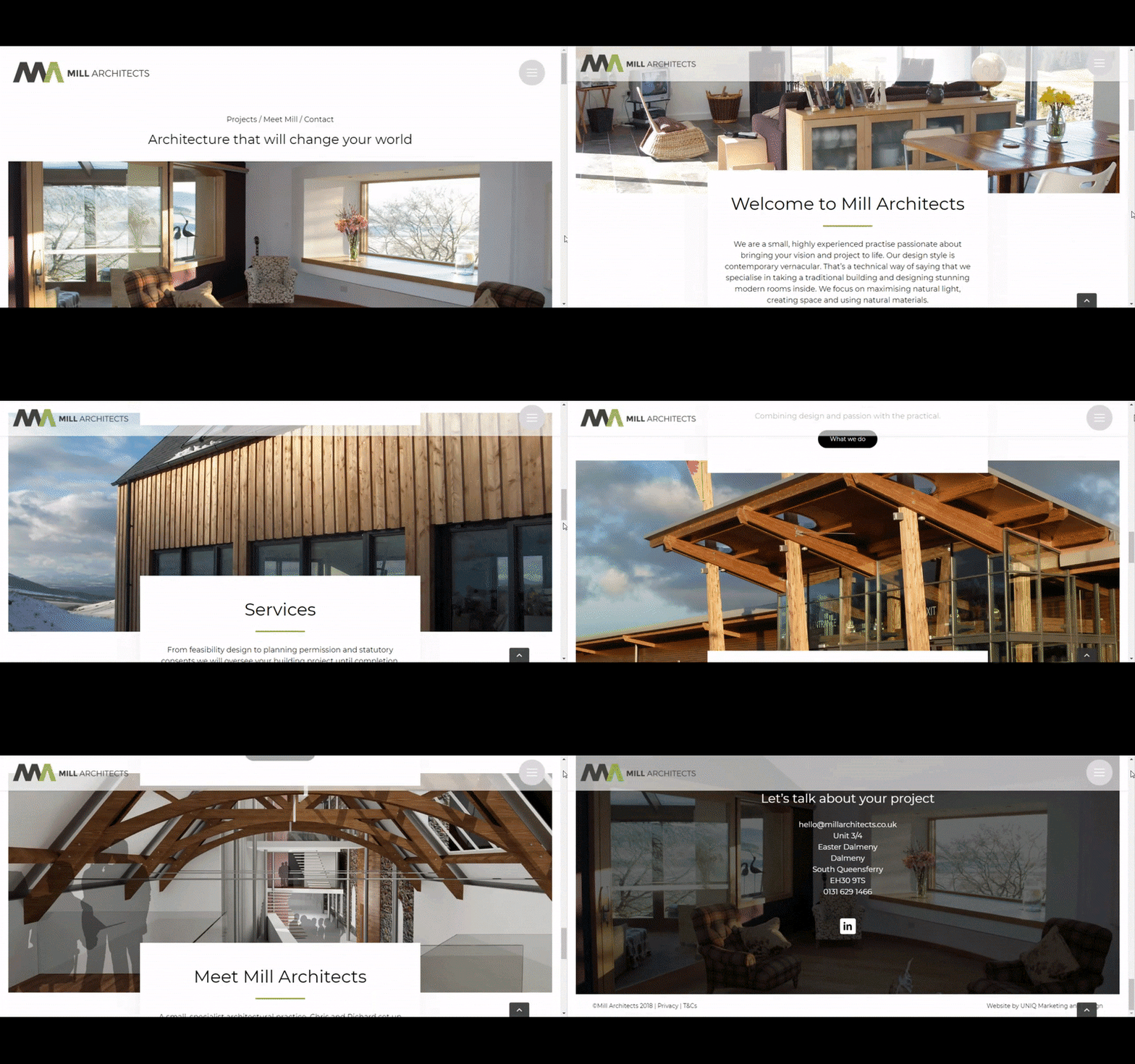
Clean, professional photography is always essential when representing visual products and services. On this site, we used an arrangement of parallax images, an animation technique that creates the illusion of depth to help customers get a sense of the company’s architectural style.
Layout
The layout of your content is an integral part of your design. Visitors need to be able to absorb your material quickly and easily. The amount of text, number of images or movement you have on a page will either engage visitors or lose them. In the design of Mill Architects website, we used white space to create a clean and simple feel. It also focuses your eye on the images.
The result? A clean, classic and easy to navigate website that focuses on the client’s work and portfolio.
.gif?width=813&name=unnamed%20(1).gif)
Check out their website here


